Editor’s note: this is a first-person craft essay from Eike H. Schumacher, a working realism tattoo artist — not a Las Vegas-based artist and not affiliated with any Las Vegas studio. We’re publishing it for its technical value to anyone studying realism tattooing at any scale.
Origins and Meanings
When people look at a realism tattoo, detail is often the first thing they notice. The texture of skin, individual hairs, reflections, wrinkles, tiny changes in light and shadow. Those details are part of what makes realism impressive.
But over the years, I have learned that being able to create detail is only half of the skill. Knowing when not to use it can be just as important.
Before I start designing a tattoo, I am already thinking beyond the image on my screen. I want to know how the finished tattoo will flow with the shape of the body, how it will look once healed, and what will still be readable ten years from now.
Skin is not a flat canvas. It moves, it ages, it changes in texture and color, and every person’s skin behaves differently. A design can look perfect on a screen and still be the wrong design for the skin it is supposed to live on.
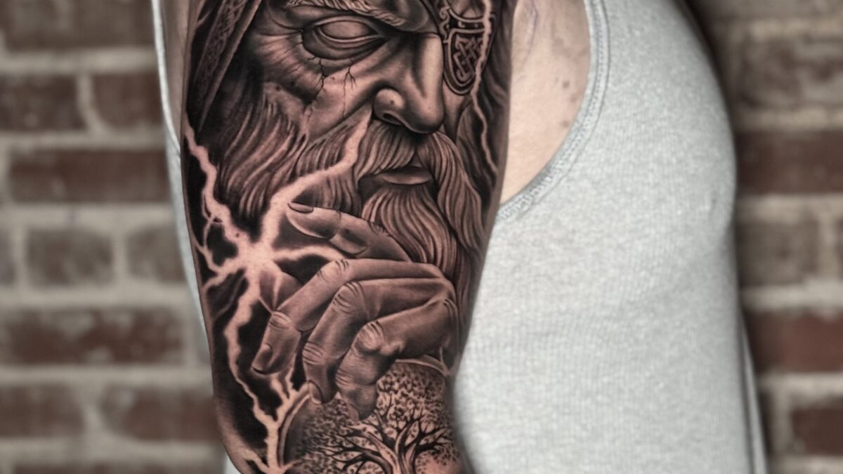
Two of my own tattoos illustrate this particularly well. One is a small Polaroid measuring approximately 3.5 inches. The other is a black and grey Odin composition extending from shoulder to elbow.
Both are realism tattoos. Both were designed entirely by me. But almost everything about the way I approached them was different.
When Small Becomes More Difficult
The idea behind the Polaroid started with a song.
My client wanted a tattoo representing a song that had a deep personal meaning to her, but instead of simply tattooing an obvious image associated with it, I went through the lyrics and identified the parts that were most important to her.
I translated those ideas into individual visual elements and then started putting them together. In a way, the finished Polaroid tattoo is actually a song translated into an image.
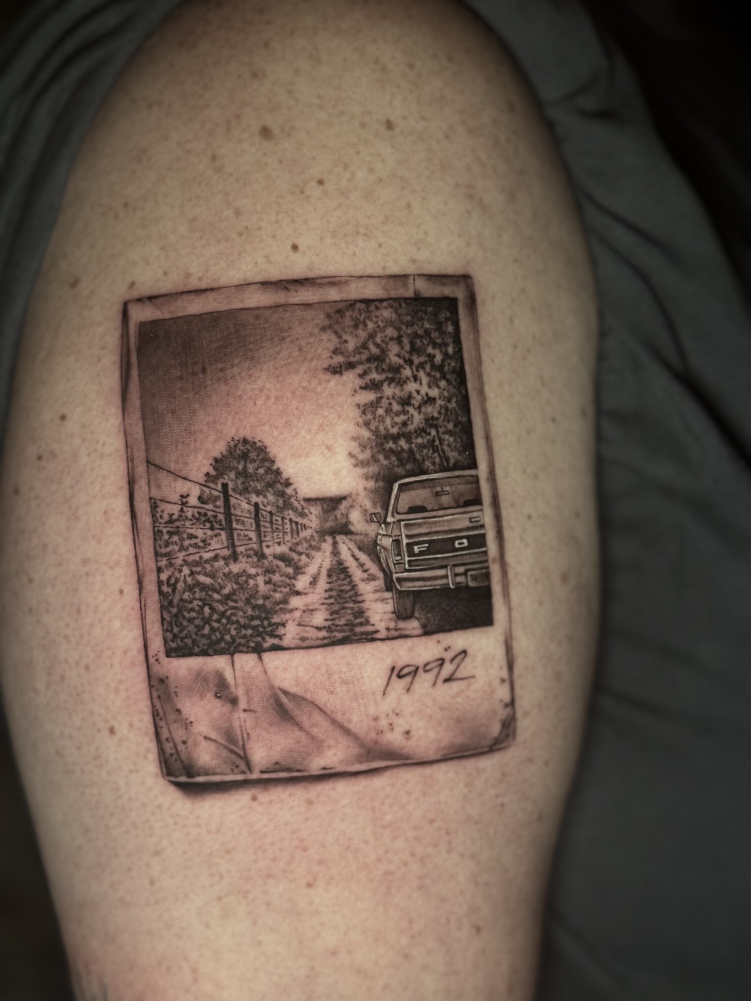
That creative process was only the first challenge. The entire tattoo had to fit into approximately 3.5 inches of skin.
This is where I think people sometimes misunderstand small realism. A smaller tattoo does not necessarily mean an easier tattoo. In many cases, I find the opposite to be true.
When I have an entire upper arm to work with, I have space to create transitions. I can gradually move from dark to light, separate different elements and give important details enough room to breathe.
At 3.5 inches, I do not have that luxury. Every line matters. Every dark area matters. Every transition occupies valuable space.
If a client wants too many details in too small an area, I tell them. I would rather explain why something needs to be changed than create a tattoo that looks impressive when it is fresh but loses its readability over time.
This is one of the biggest lessons experience has taught me: more detail does not automatically create a better tattoo. Sometimes the more difficult decision is determining what can be removed.
The goal with the Polaroid was not to reproduce every possible detail. It was to retain enough information that the viewer immediately understands what they are looking at while still creating depth, atmosphere and realism.
There is a point where additional information stops improving an image. The eye becomes too busy searching through everything instead of seeing the composition as a whole. That applies to large tattoos too, but on a small tattoo the consequences are much more immediate.
More Space, Different Problems
The Odin piece presented almost the opposite challenge.
The tattoo runs from the shoulder to the elbow and took approximately 12 hours to complete. The client came to me wanting a large tattoo that combined Odin and a tree, but he did not have a specific composition in mind. That meant I had to create the visual story myself.
I researched the mythology and began developing the design around the anatomy of his arm. I knew I wanted Odin’s face to be as large as possible because the face needed to create the initial impact of the tattoo. But I still had to connect Odin to the tree.
That is where the hand came into the composition. It visually connects the portrait to the lower part of the design and creates the impression that Odin is almost holding the tree.
The placement of those elements was not arbitrary. The shape of the shoulder, biceps, triceps and inner arm all influenced where the face, hand and tree could sit. I also introduced negative elements to create a bridge toward the light surrounding the tree. I like working with negative space because it can create depth and movement without adding more information.
That distinction is important. Having more skin available does not mean I want to fill every inch of it with detail. If everything is detailed, everything competes for attention.
When someone sees one of my larger tattoos, I want the first reaction to be immediate. I want them to see the complete piece and think, wow. Then I want them to move closer. That is when they should start discovering the smaller details in the face, the textures, the transitions and the elements they did not notice at first.
A tattoo needs a visual hierarchy. The viewer should not have to search for the subject. The extra space in a large tattoo gives me more freedom, but it also gives me more responsibility over where the eye goes.
The Tools Change With the Scale
The difference between these two tattoos is not limited to composition. I physically tattoo them differently.
For large realism pieces like the Odin tattoo, I work almost exclusively with a 27 Soft Edge Magnum. It allows me to build large, smooth transitions and blend shadows while still controlling the values I need to create depth.
For a small tattoo like the Polaroid, my approach changes completely. There I primarily work with 3 and 7 Round Liners.
When several important details exist within a very small area, every dark value has to be intentional. There simply is not enough space to treat the image like a scaled-down version of a large tattoo. I also work strategically with greywash, lighter grey tones and white in tight areas where I need to maintain visual separation.
One thing I pay particular attention to is avoiding the temptation to solve every detail with another black line. That is something I often see less experienced artists do. They are afraid of losing the stencil or losing an element of the reference, so they define too much of the image with dark lines.
The result may look extremely detailed immediately after the tattoo is finished, but that does not necessarily mean it was the right decision for the tattoo. Sometimes a soft shadow communicates an edge better than a line. Sometimes an area needs to remain lighter. Sometimes the best technical decision is to leave something alone.
That is why I do not think of small realism as simply “large realism, but smaller.” It requires a different strategy.
Contrast Is Everything
Regardless of scale, one principle connects both approaches for me: contrast.
Contrast is everything in realism. It creates depth, separates elements and gives an image the sense of life that makes it feel three-dimensional.
But contrast does not simply mean putting the darkest possible black next to the lightest possible area. The placement of those values is what matters. With the right greywash tones and the right amount of darker pigment in the right places, you can create the illusion of depth on a surface that is physically flat.
I also do not always leave untouched skin between two darker areas. Sometimes I will move across that space with a lighter greywash to make the transition feel complete rather than leaving the elements visually disconnected. For me, shadows have to flow.
If I see a shadow that looks chopped up or a line that does not belong, it immediately disrupts the realism. The viewer might not consciously understand why something feels wrong, but the illusion has already been broken.
Contrast also becomes important when I think about the future of a tattoo. Skin does not stay the same. It tans. It ages. Its texture changes. Bodies gain and lose weight. The skin can become thinner and develop wrinkles.
I cannot control what someone’s skin will look like decades from now, but I can make design decisions that give the tattoo structure. That is one reason I value contrast and negative space so much. They are not only there to make the fresh tattoo dramatic. They help establish a composition that has room to remain readable as the skin changes.
The Skin Gets the Final Say
There is another reason I never treat the digital design as an absolute set of instructions. The skin in front of me gets the final say.
I change my designs while I tattoo. Not dramatically, but enough that I consider it a normal part of my process. Every person’s skin is different. Someone with a lot of freckles may take pigment differently in certain areas. Older skin can be thinner and may swell differently. Some skin accepts pigment very easily, while other skin makes you work differently to achieve the same visual result.
A good tattoo artist has to recognize that and adjust. You can have the right design, the right machine, the right needles and the right pigments, but you still have to respond to what is actually happening in front of you.
This is where one of the rules I remind myself of becomes important: trust the process. If I know the design works, I know my materials and I know what I am capable of, I do not need to panic because one area of skin behaves differently than expected. I adjust my technique and continue building the tattoo. For me, the design is not truly finished until the tattoo is finished.
Experience Teaches Restraint
When artists are starting out, I think there is a natural desire to prove what they can do. You want to put everything into the tattoo. Every texture. Every line. Every detail you can see in the reference. I did that too.
With experience, I became much calmer about the process. I learned that quality takes time, but I also learned that technical ability is not demonstrated by using every technique you know in every tattoo. The better question is whether the tattoo actually needs it.
That is the real connection between the Polaroid and Odin. The Odin piece gave me enough space to work deeply into the wrinkles, facial structure and textures that make the character feel alive. The scale supported that information. The Polaroid required almost the opposite mindset — I had to make sure the concept was immediately recognizable without overloading a very small area.
One tattoo required me to know how much detail I could add. The other required me to know how much detail I could remove.
And that is why I sometimes say that small realism can require more skill than large realism. Not because large-scale work is easy, but because experience is what teaches you how to create depth, contrast and detail when there is almost no room to do it.
Technical skill allows you to create detail. Experience tells you how much detail the tattoo actually needs.
For me, that is ultimately what makes realism work on skin. It is not about putting as much information as possible into a tattoo. It is about making the design flow with the shape of the body, making it look vivid, and creating enough depth and contrast that the image feels alive.
And sometimes, the most important detail is the one you decide not to put in.
About the Author
Eike H. Schumacher is a tattoo artist and owner of Carolina Icon Ink in Mt. Holly, North Carolina. He has 15 years of tattoo experience and specializes in Black & Grey Realism, Color Realism, and Micro Realism. His work has earned multiple first-place awards at Villain Arts tattoo conventions as well as a Charlotte’s Best Award, and he regularly attends Villain Arts conventions as both an exhibiting artist and a judge. What matters most to him is taking the time to really listen to his clients, understand the stories behind their ideas, and turn those stories into original designs created specifically for them and their skin.